A Fresh Look for Future Leaders in Education
This website design project was completed in 4 months in collaboration with Tyndale University’s web manager and stakeholders including the Admissions and Bachelor of Education department.
Organization
Tyndale University
Tyndale University is a Christian university in Toronto offering a wide range of programs at the undergraduate, seminary & graduate levels. Tyndale's Bachelor of Education (BEd) program is a unique program that accelerates the process to become a certified teacher in Ontario over 16 consecutive months.
Purpose of the Redesign and Goal
The Bachelor of Education is a unique program among all other Bachelor programs at Tyndale University. The purpose of the redesign was to lead with a compelling story and path for potential students to explore by streamlining the admissions program track information to increase student applications.
Research and Strategy
Content Audit
The first step was to audit the web section including the home page and sub-links such as the different program tracks, information about tuition, application information and information sessions. This includes creating a plan for new URL paths and redirects.
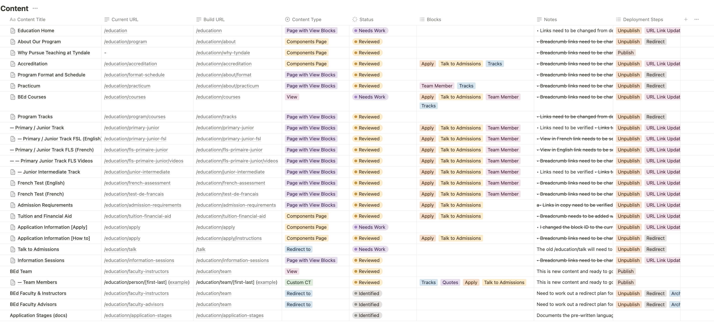
Using Drupal as a Content Management System, it was important to organize the different Content Types, Views and Blocks that will be used to communicate with the web developer and web manager.
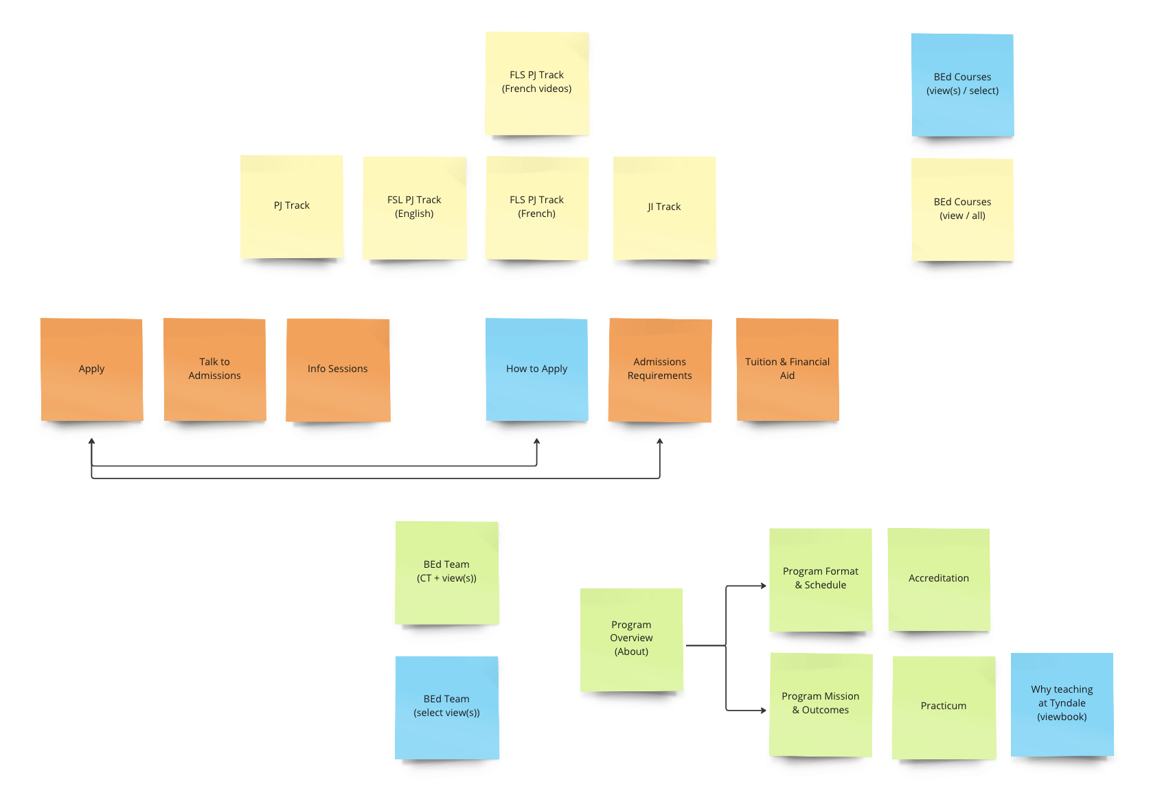
Documenting all affected web pages led to planning out the structure of the new section. The diagram below is a brainstorm exercise that inform myself and the web manager to help categorize information as a stand-alone pages, a sub-section, or a page with content views and/or blocks.
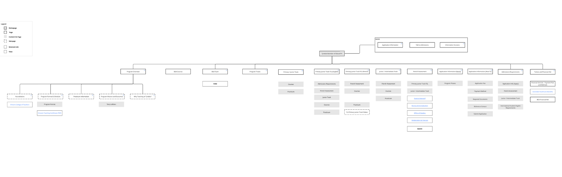
Determining the content structure of the site informed the overall information (IA) structure including all relevant sub pages. The image below is a screen shot of the same IA split into two parts.
Challenges
French Information Kept in spite of Google Analytics Data
- Challenge: There are three program tracks in the BEd program – Primary Junior, Primary Junior French as a Second Language (FSL) and Junior/Intermediate. The challenging part of the design was to decide whether to keep a French version of the Primary Junior FSL web page.
- Solution: Google Analytics emphasized a low-view count and high bounce rate, but the web pages (and relevant sub-pages) were kept and re-organized after consulting with the Department of Education.
Turning Static Content into Blocks
- Challenge: Updating content about the Application period for the program was done manually by changing the date in several different sub-pages. Duplicate information created a challenge to maintain information that was true in several different pages.
- Solution: By first identifying duplicate content through the Content Audit, I was able to communicate with the Web Manager to create Blocks on Drupal. Creating a Block allows me to update content once in the back-end, enabling me to plot out the block in multiple pages without manually updating each page.
Faculty
- Challenge: The Bachelor of Education had multiple faculty members and education advisors (who are not hired as teaching faculty). The current site had two categories that separated members of the program. The challenge was to decide how to unite both categories that would beneficial for future maintenance of profile set-up and marketing the program holistically.
- Solution: Communicating with the Web Manager and the Director of the Department, it was feasible to create a new category that informed the decision to build a new content type to unite all members. By creating a new template for each member, a new category was created entitled ‘BEd Team’.
Design Strategy and Development
Lead with Prospective Students in Mind
The website redesign included updated the micro-copy and content layout patterns from a comparison study of other university websites.
New templates and content blocks were created that enabled a better experience for website maintenance (as administrator) and for content readability (as a prospective student online).
Organize Content for Readability
What was designed:
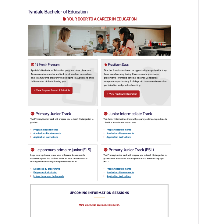
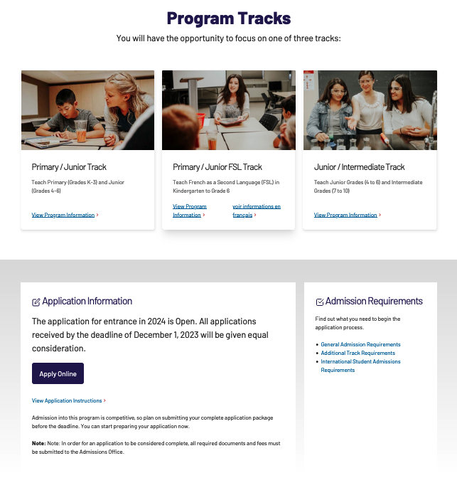
- Program Tracks
- Before the website redesign, there were four content cards that included Primary/Junior FSL translated in french copy. To avoid confusion of four different pathways, the design decision was to display three content cards after a comparison study of different layouts other university websites.
- including in-house images in each content card, gives each program track their unique style that aligns with the Tyndale University brand identity.
- Content Block
-
Static content about Application information was turned into a block. Given information about Application would change often in different sections of the site – including a content block on the main web page was designed for better website maintenance.
-
Keeping it Simple with Grid
What was designed:
-
Bachelor of Education Team
- Lecturers, faculty advisors and part-time instructors were migrated into one category as the Bachelor of Education team. A content-grid teaser view was created that would generate a different set of faculty every time the page was refreshed. This design decision was made for better website maintenance and aligns with the University’s brand values of unity.
-
Grid Layout of Important Information
- Complementary information about tuition, admissions, interesting courses and information sessions were displayed in a four-column grid layout. This recurring web layout pattern would help readers scan as they would when looking at the department team.
Reflection
Learned how to coordinate with the Web Manager and Organization Stakeholders
There was a need to maintain the truthfulness of information on each web page. Collaborating with the Bachelor of Education department and Admissions team to determine the appropriate language and tone of the web copy was a challenge.
During the content audit process, I learned how to pivot base on the department’s needs about the right information to publish on the web. When creating template web pages, I was able to communicate well with the web manager about how to design the web pages based on the amount of content given, its importance and relationship to mobile-desktop responsiveness.
Content informs Layout Structure
Auditing the content helped me organize what information needed restructuring. The previous navigation experience included a sidebar menu forcing visitors to click on sub-links to discover program track information. The design to remove sidebar menus and secondary pathway links helped me critically think about what content should be grouped and how it should be presented.
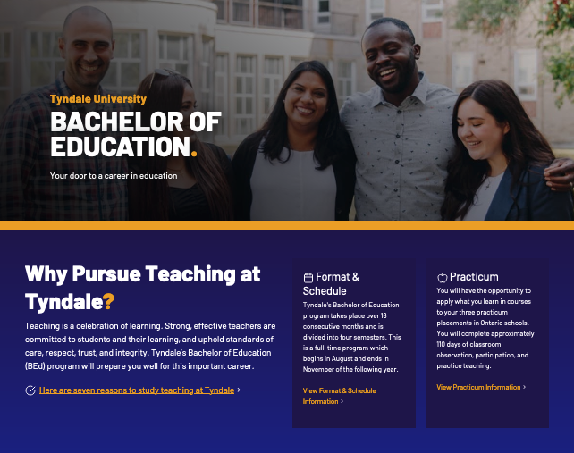
Identifying the important elements that students need to know about the program helped inform specific content (e.g. Reasons Why to Study, Program Format and Practicum) to be displayed above the fold. A decision to layout student information in one section was made to highlight student information.
Keeping Accessibility in Mind
Meaningful links were top of mind when reviewing the website copy of each page. I learned that clearly communicating the destination of each page link is important for screen readers and search engines. Providing link text that give readers the context of where they are going is an accessibility lesson I learned for better user experience.