Culture First: Redesigning the CIRO Experience for Future Talent
This website design project was completed in 2 months using Drupal and SharePoint in collaboration with Human Resources and Corporate Communication and Public Affairs.
Organization
Canadian Investment Regulatory Organization
The Canadian Investment Regulatory Organization (CIRO) is the national self-regulatory organization overseeing Canada’s investment and mutual fund sectors. Formed through the consolidation of IIROC and the MFDA, CIRO works to protect investors and strengthen confidence in the Canadian capital markets.
Purpose of the Redesign and Goal
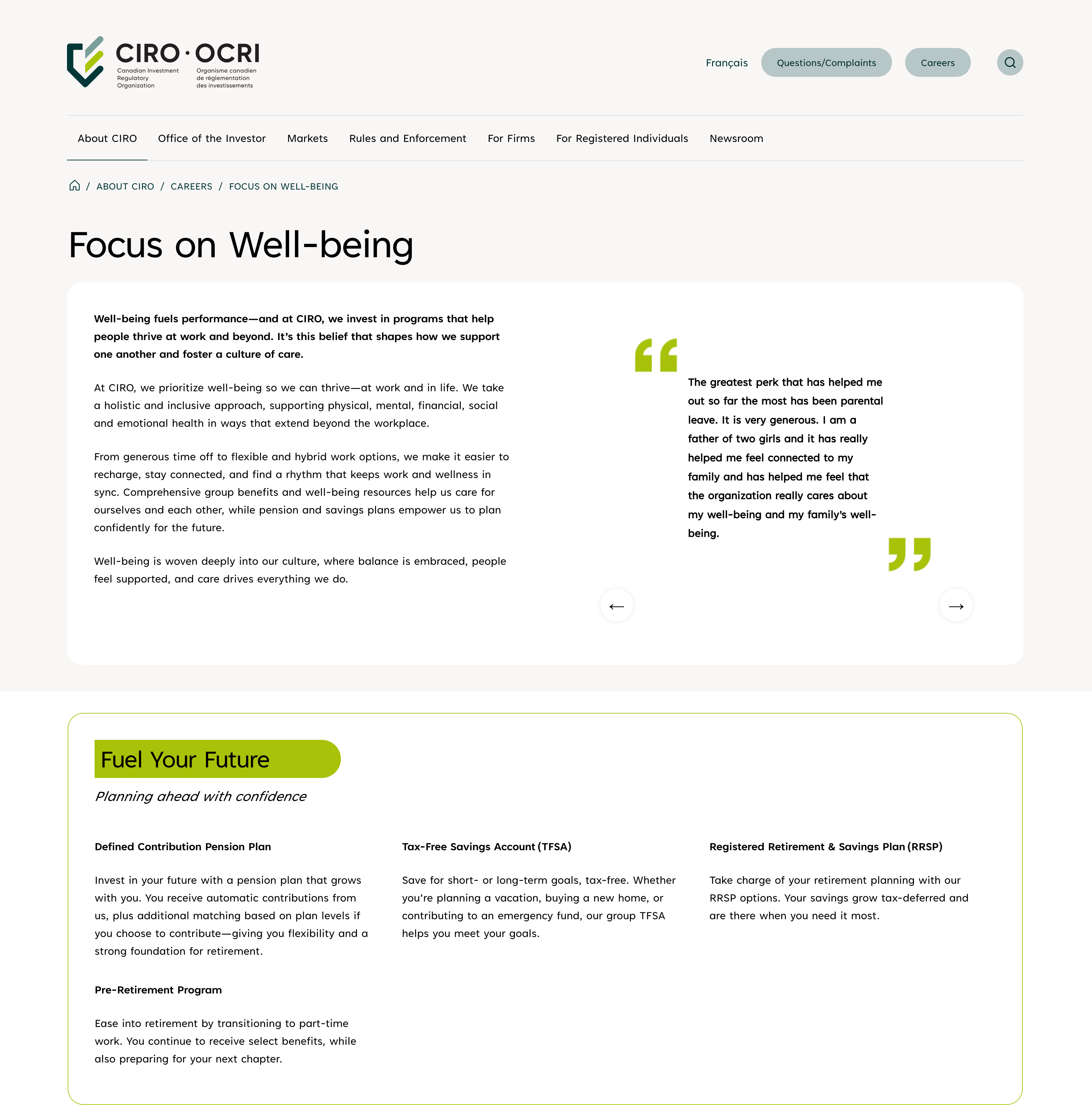
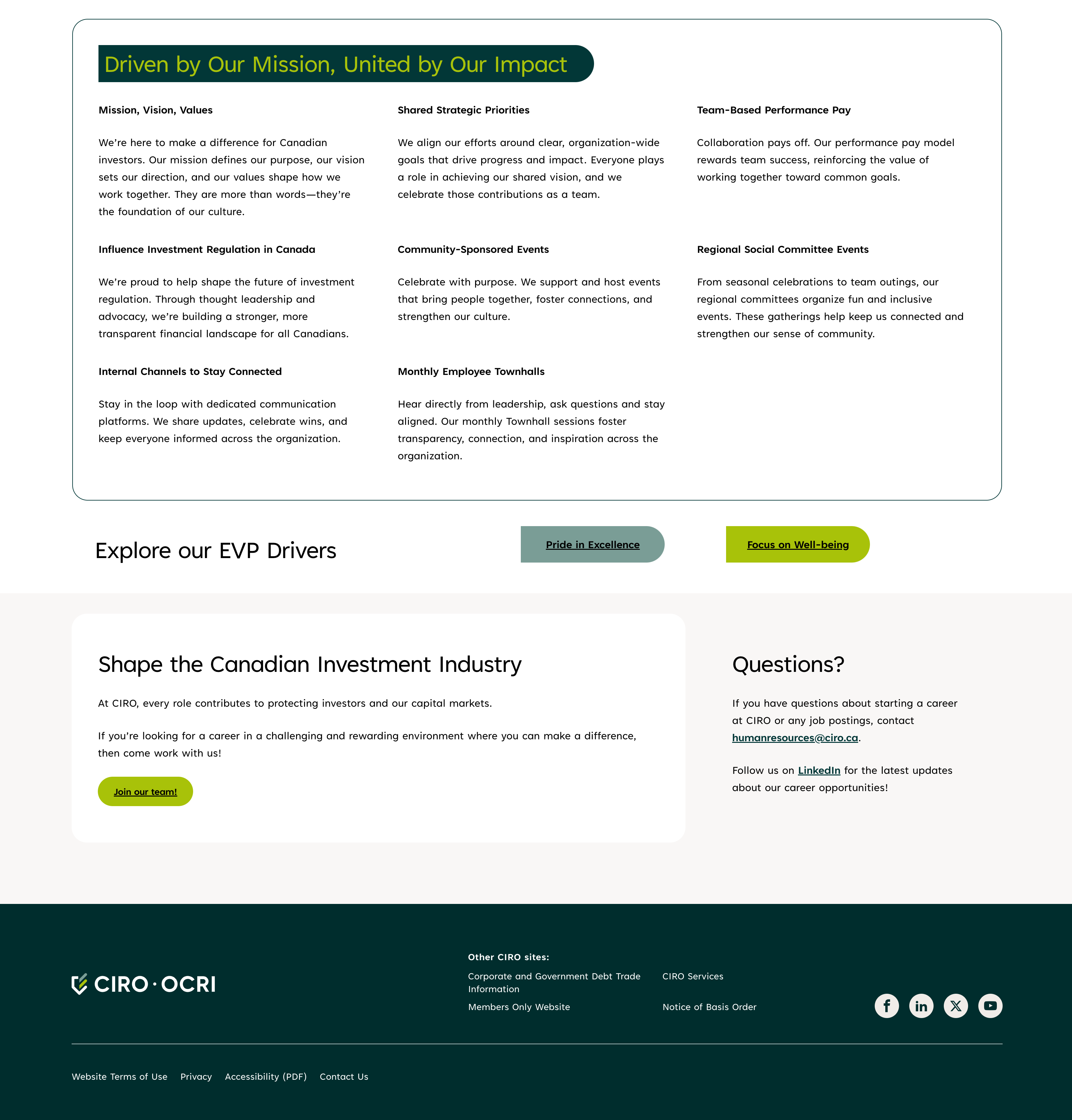
The purpose of the redesign is to display the organization's culture, values and benefits as a strategy for recruitment and employee retention. The Employee Value Propositions (EVP) are driven by three core pillars: Pride in Excellence, a Focus on Well-being and a Shared Purpose.
Including these pillars into the CIRO brand provided the opportunity to re-thinking the web experience on both CIRO's public facing website and employee internal site (intranet).
Research and Strategy
Website Comparison
Human Resources came in with different ideas on how to re-strategize their website recruitment strategy and this led to on-going discussion and comparison of other HR sites including Canadian banks and retail food chains like Starbucks.
Site Structure Diagram
The old structure had one simple page to highlight recruitment, but weaving the Employee Value Propositions (Pride in Excellence, Focus on Well-being, A Shared Purpose) into CIRO's brand involved creating sub-pages that would eventually lead to content being buried too deep in the site hiearchy.
The proposed site structure re-positioned important information including the organization's commitment to inclusion, accessibility and its mission on the main careers page. The main careers page was re-designed to identify dead-end points of exploration, leading online readers to either learn more about CIRO's EVPs or learn about open job opportunities.
Challenges
Brand marks and Styling
Fresh corporate photos, icons, pops of colour and clear heading structures of CIRO's culture and employment benefits became a part of the redesign. One notable change was removing side-bar links on the page to provide wider real estate for content and to reduce scrolling.
Accessibility
A new clickable carousel was created to display testimonies built with JavaScript. Displaying dynamic content on the fly with limited time led to prioritizing function more than accessibility. The carousel used tab-index to ensure users can reach controls of the carousel but lacked aria-labels to specify what each control does.
An aria-label could have been applied to the arrow control button, described as "Previous Testimonial" or "Next Testimonial".
Design Strategy and Development
Mobile first layout
Collaborating with stakeholders from HR involved many conversations about layout, icons, colors and content - and I made sure to validate their ideas with a mobile first approach. It was important in the design phase to ensure the copy, images and a new carousel component was flexible to stack on-top of content on mobile devices and expand in larger devices such as tablet and desktop view.
New Carousel Component
Each EVP item had a new carousel component that lists out employee testimonials.
Applying the concepts of arrays, objects, template literals and event listeners to create a new carousel component was an exciting challenge. I found ways to make the carousel accessible using keyboard controls and designed it with color matching quotation images (svg) to brighten up the page using CSS flexbox.
Re-thinking call-to-action
EVPs provided the opportunity to expand the CIRO brand story while looping in online readers to the job portal and not leaving them at a dead end. A section was created at the end of every page to point readers to the job application portal.
Each EVP call-to-action button was color-matched with the elements on the chevron logo. Incorporating elements of the CIRO logo as buttons to reflect the pillars of the EVP was a design choice in connecting the organization's culture to its mission of protecting Canadian's financial future.
Reflection
Content cannot be an after thought
There could have been opportunities on my end to provide a content template for the content to be finalized before designing in order to plan for accessibility features and better information architecture.
Receiving content first would have avoided rework and made the process smoother with content hierarchy and flow. Through this experience, I was able to quality check content across the public-facing website and intranet to ensure the copy and website layout remained consistent.
Re-thinking carousels and accessibility
Creating a new component on the site has allowed me to be more prepared to include accessibility as part of the process rather than an after-thought during the quality assurance phase. Although I included attributes that helps readers who rely on keyboards using the Tab key, there were areas missed to enhance accessibility using aria-label.
With this in mind, the same type of people cannot hover on elements, therefore instead of targeting the arrow buttons to control the quote carousel using the hover state - the focus state should be used.
This experience will help me become more intentional with keeping accessibility in mind with a list of attributes to include when building a component in the future.